Case Study: Brand Development for Zach Caddy Photography
When Zach decided to take his passion to full-time status, eGuide was there to help create a brand and logo that was reflective of Zach’s style and approach.
Overview
Zach Caddy found his passion for photography and has been shooting weddings, portraits, and live music since 2013. Growing his hobby into a business has been an organic process for Zach and as 2021 neared and Zach looked to the other end of the COVID-19 pandemic he made the decision to elevate his brand with an updated branding suite and website.
eGuide has been a partner of Zach’s since the beginning of 2021, starting our collaboration with business coaching. Through an exercise called V2MOM we were able to gain a fundamental understanding of Zach’s short term and long term goals, which lead to a much easier transition into branding and design.
Through a 2.5 month process eGguide work with Zach to create a brand suite and website that truly captures the mission, values, and work of Zach Caddy Photography.
Approach
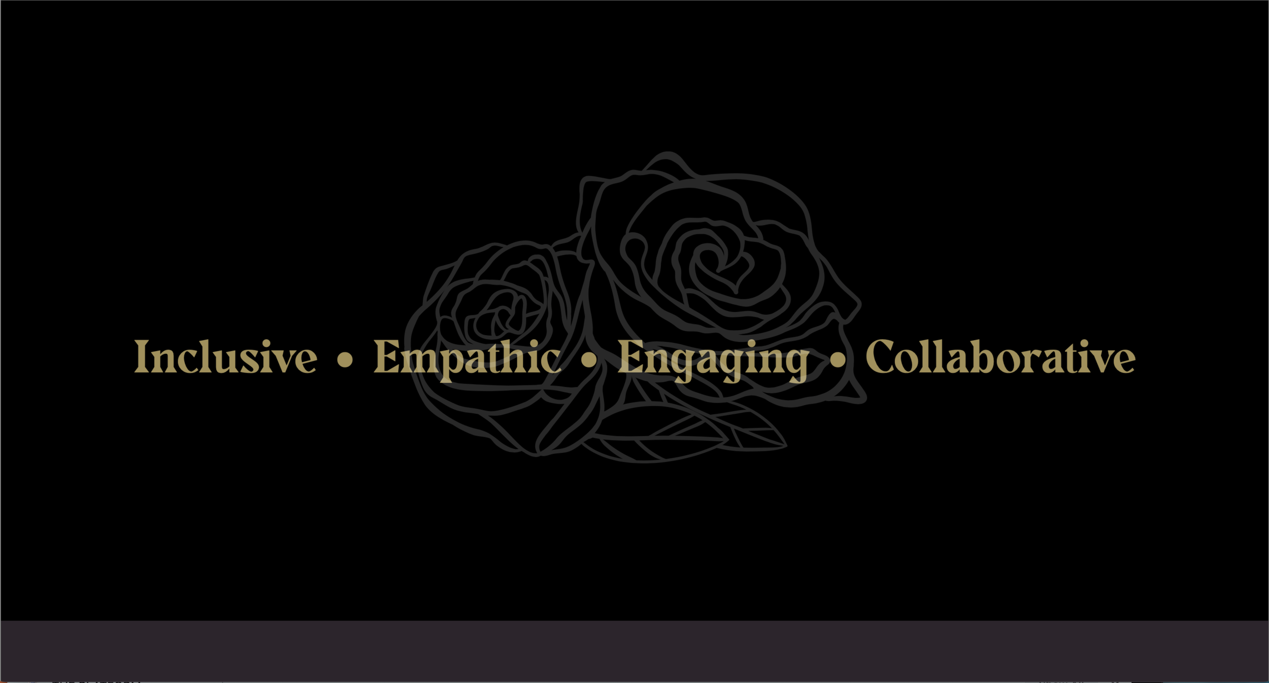
Leveraging what we learned from our business consulting workshop, we began the branding journey with Zach by hosting a Brand-storming session. This 2 hour session begins with a deep dive into identifying a unique set of keywords that capture the core of the brand. This allows us to identify the voice and tone of the site. With the keywords identified we guide the conversation through a series of values and vision exercises, and look through 2-3 competitor sites that are both illustrating some of the desired functionality of the site and brand, and also an example that has some clearly illustrated shortcomings.
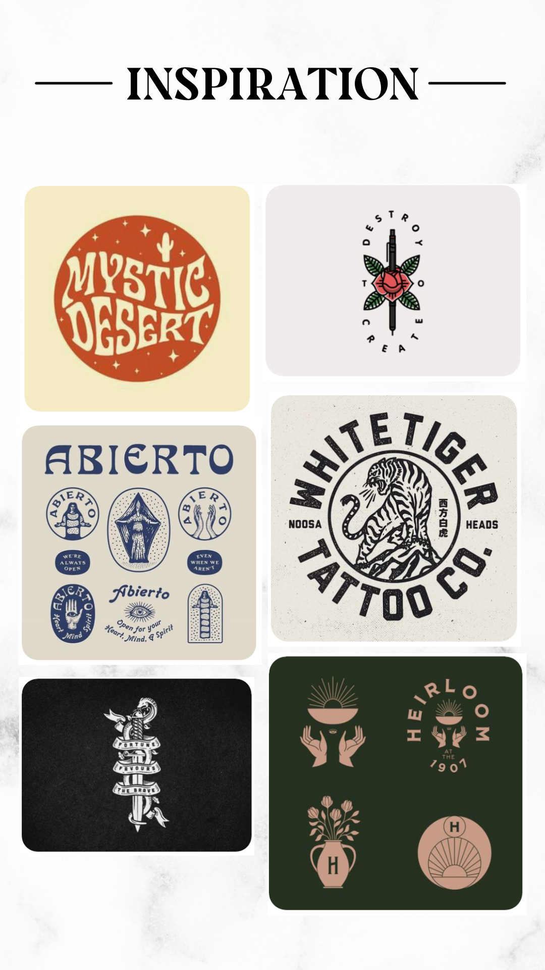
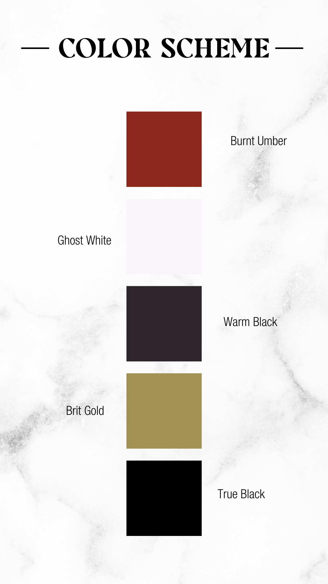
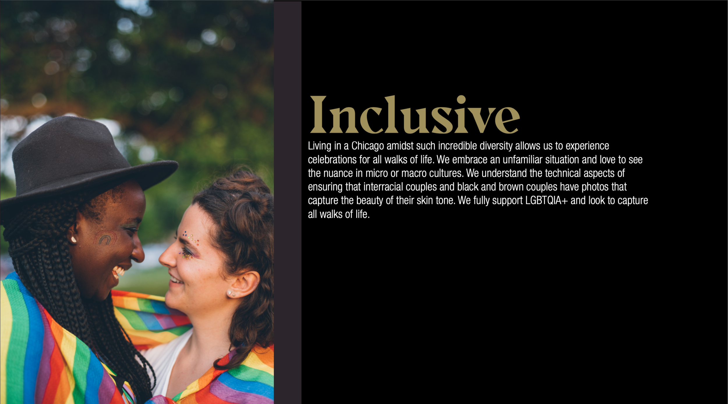
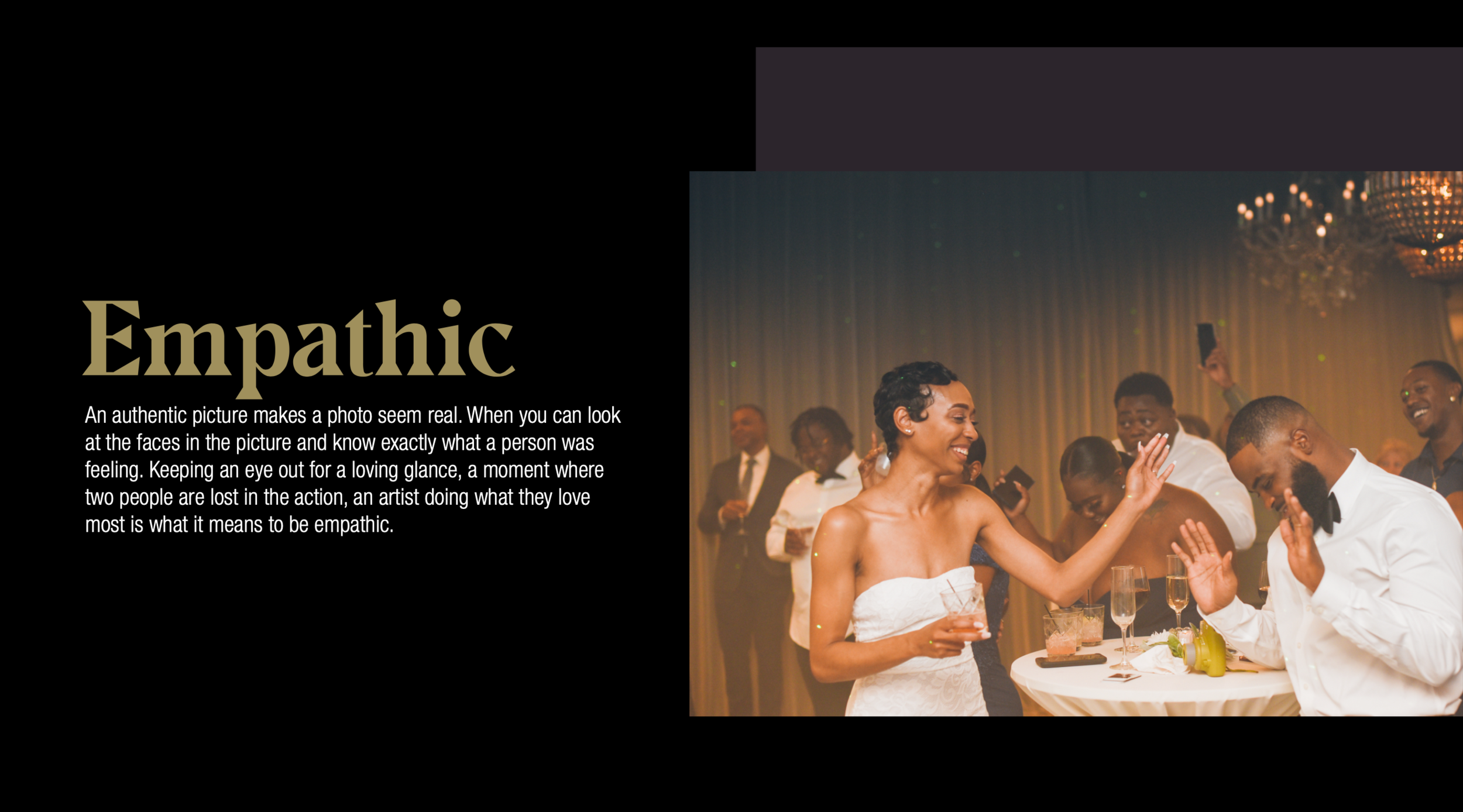
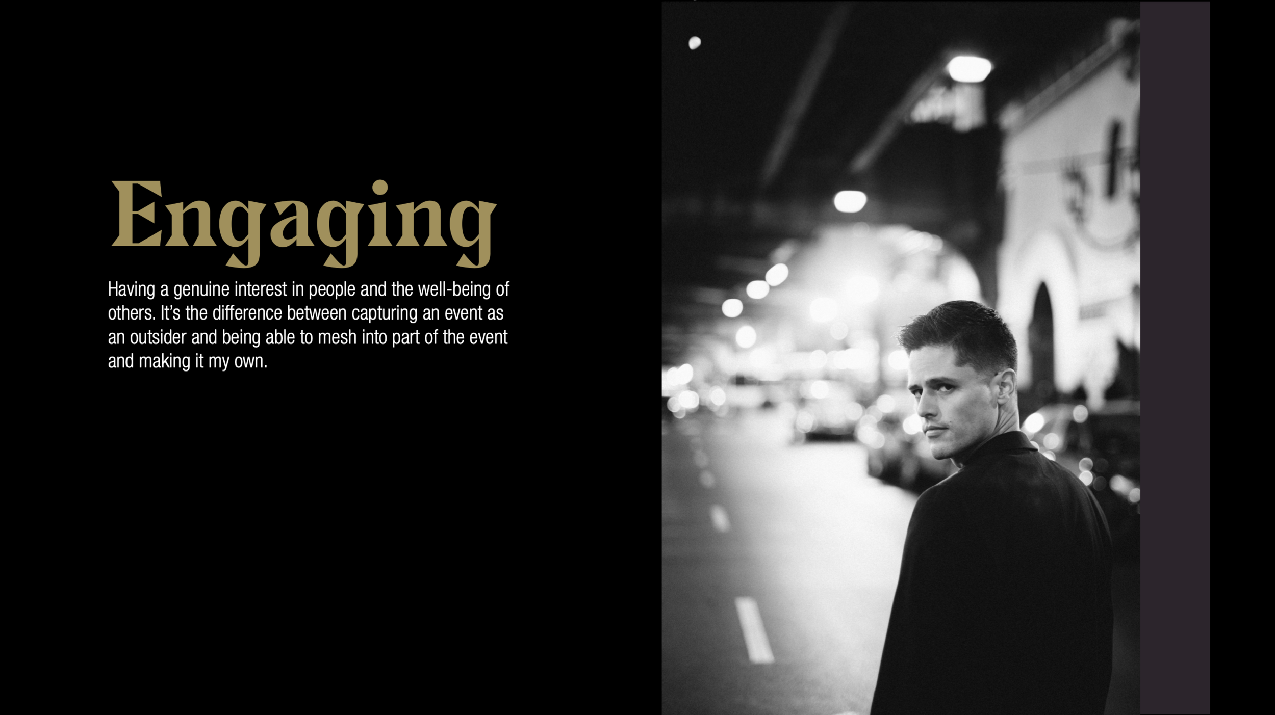
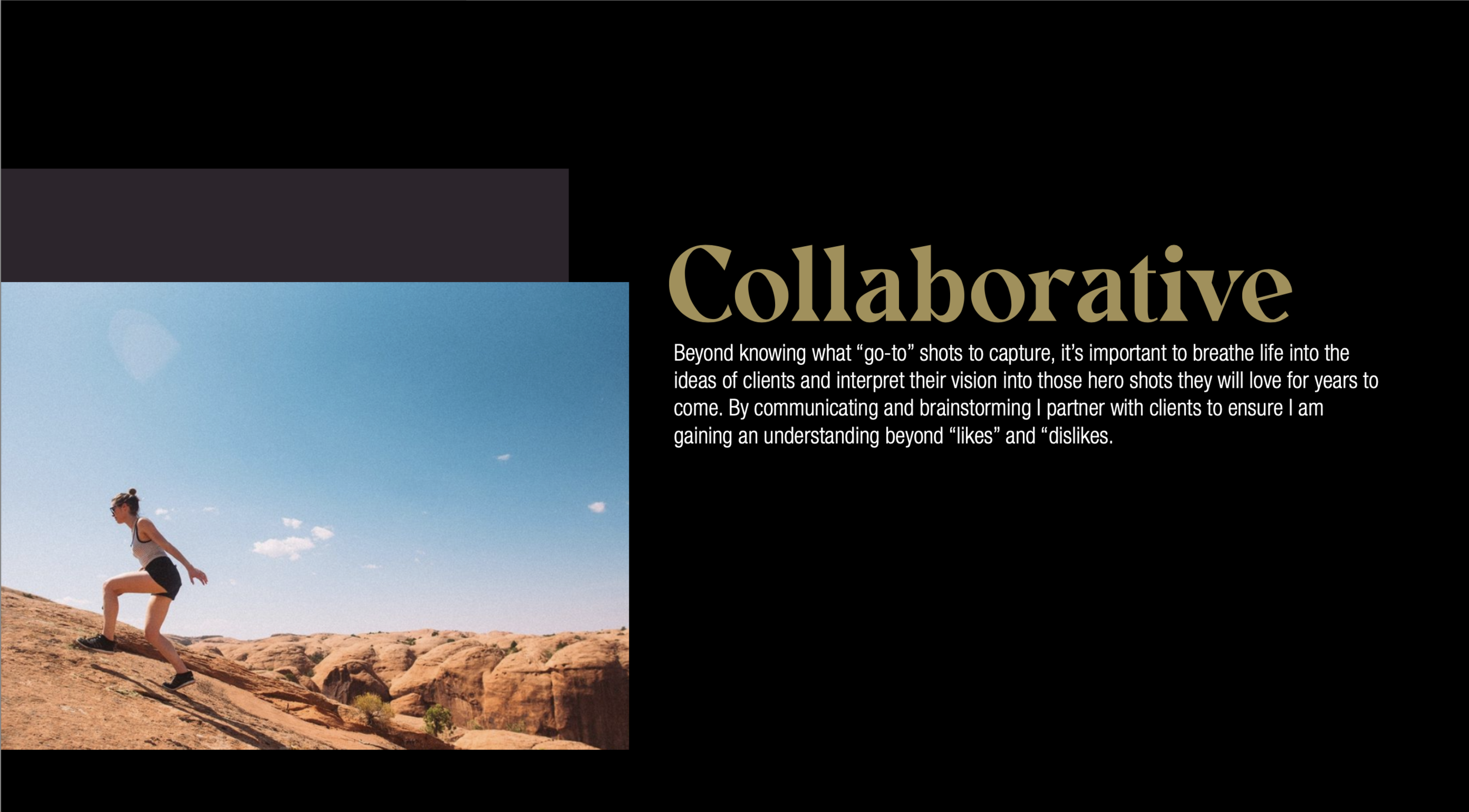
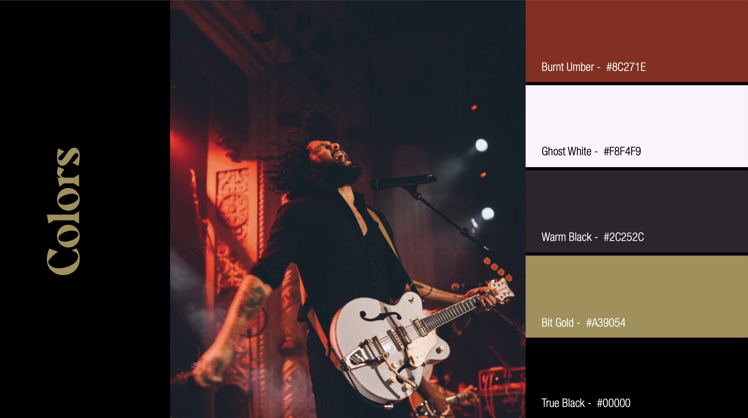
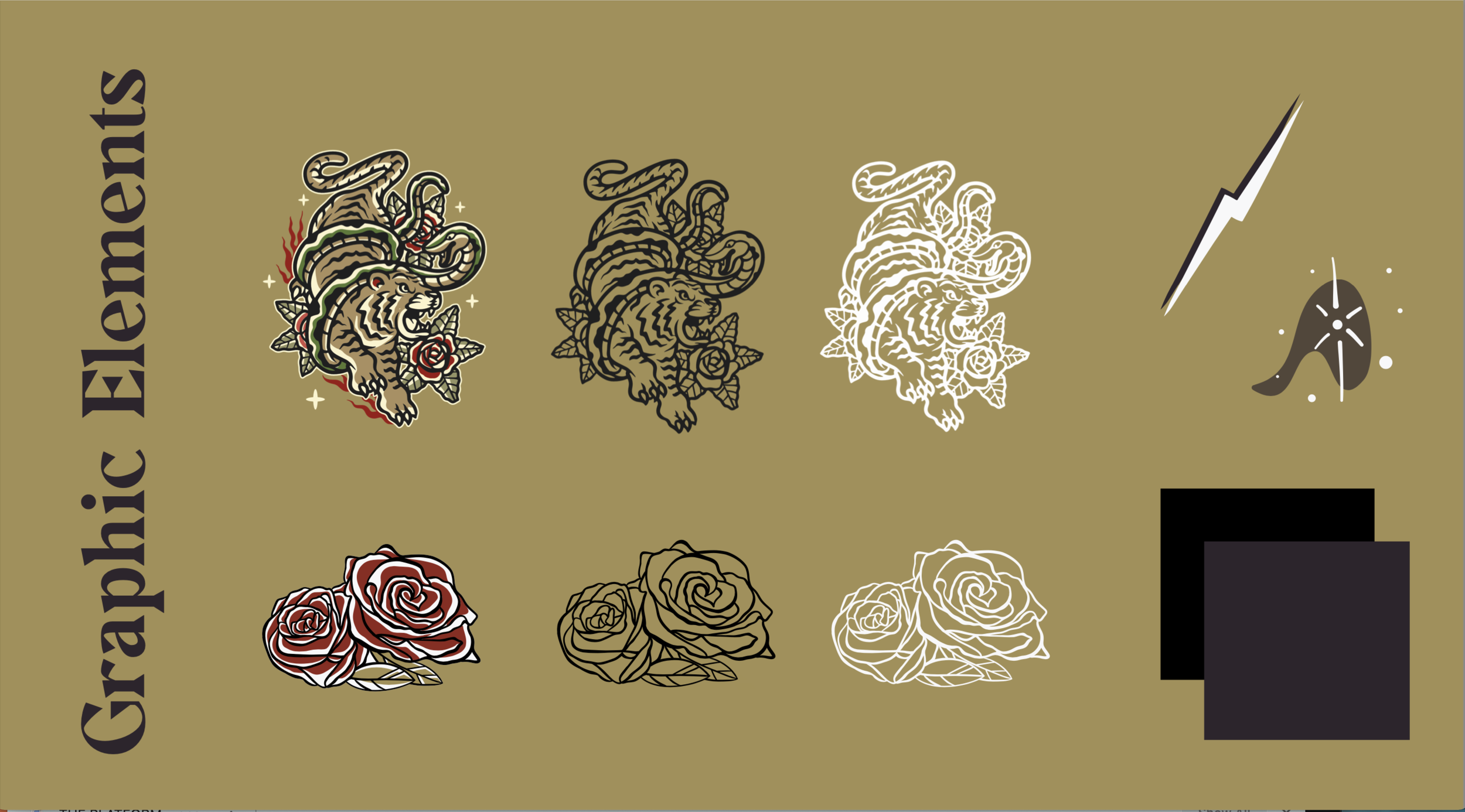
With the Brand-storm complete, Zach was given some homework to pull any imagery that inspired him that we could incorporate into the logo design into a Pintrest board. Zach was able to compile a strong representation of graphic elements that evoked 1970s tattoo art, with a touch of modern line design, and a slight rockabilly flair. This was combined with a selection of Zach’s favorite photographs, and the direction that Zach wanted his brand to be based in a darker color scheme including some reds and golds.
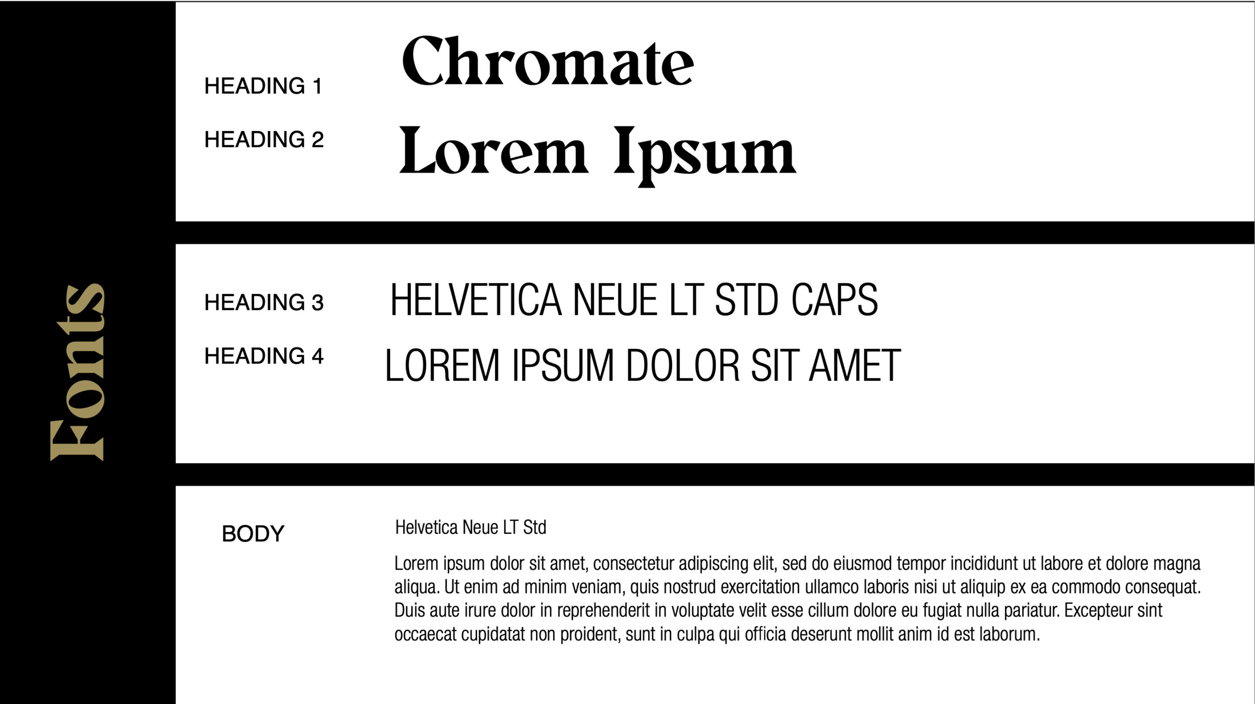
To help the process along, eGuide then drafted a preliminary brand book incorporating various elements that helped to illustrate a design direction. This step allowed us to identify what resonated with Zach prior to going into logo design. During this step we realized that we wanted to exclude any use of texture and instead incorporate an embossing effect by using two tones of black, and also steer away from a graphic suite and rather use 2-3 graphical elements throughout the site.
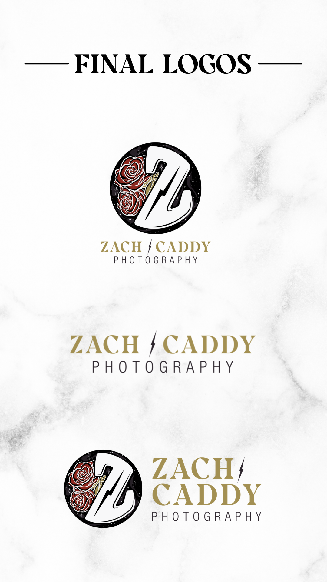
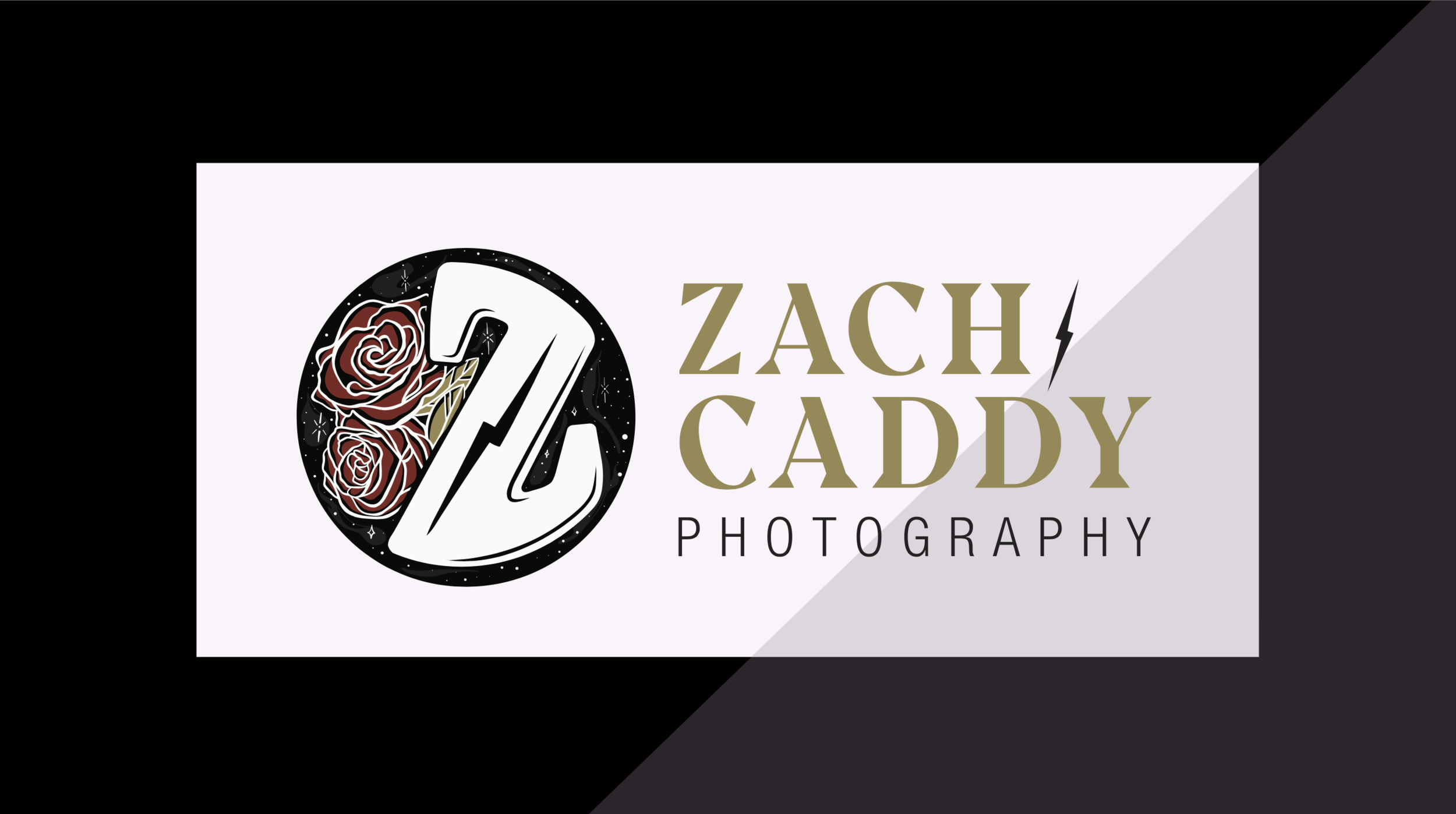
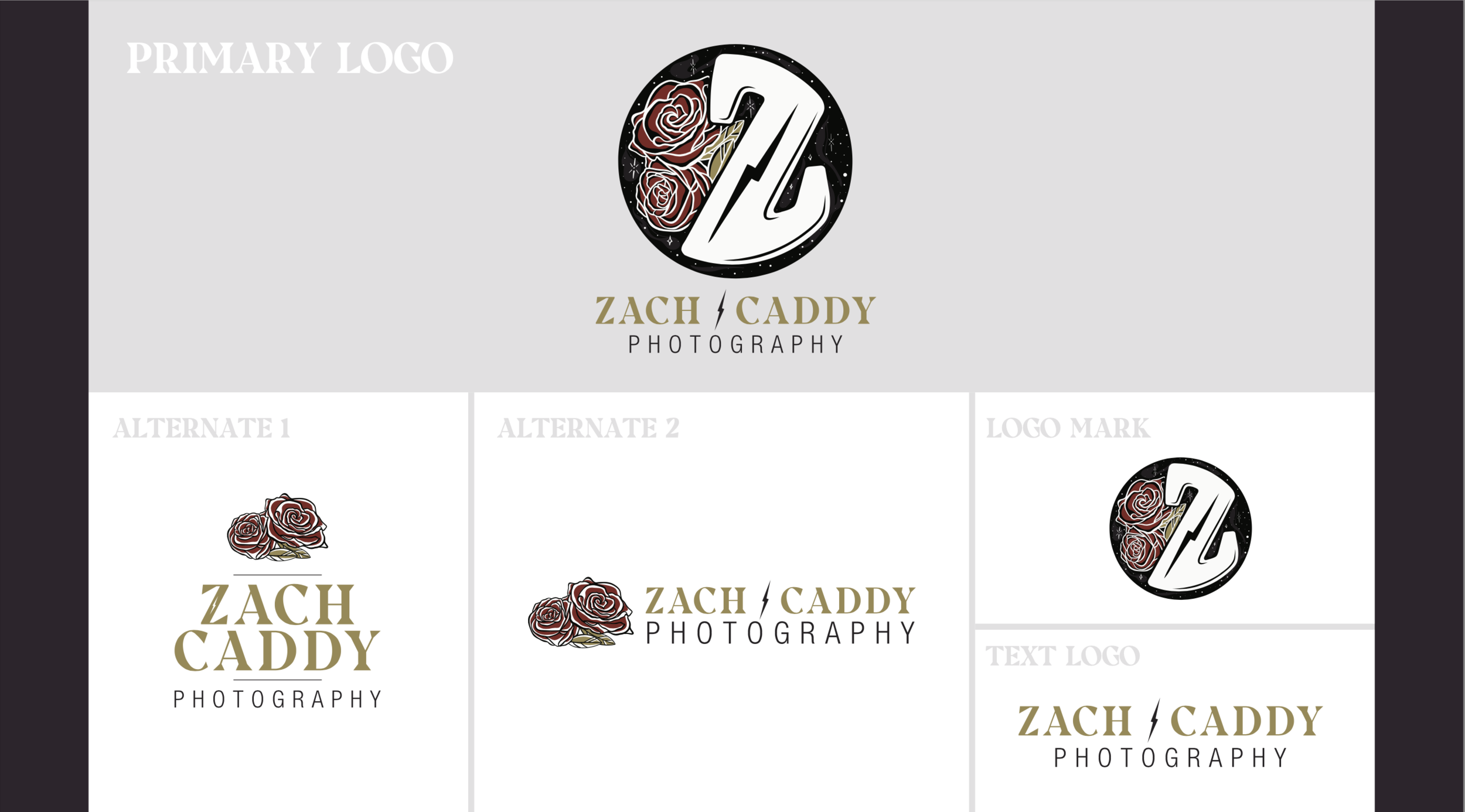
With the preliminary brand book complete, eGuide moved into logo design. The process included two rounds of revisions and was streamlined by offering three distinctly different logos in round one, narrowing it down to a core concept, and then refining and finalizing that concept into the finished logo suite. Using the preliminary brand book as a guide, the process allowed our design team to easily connect the dots on where the project was going.
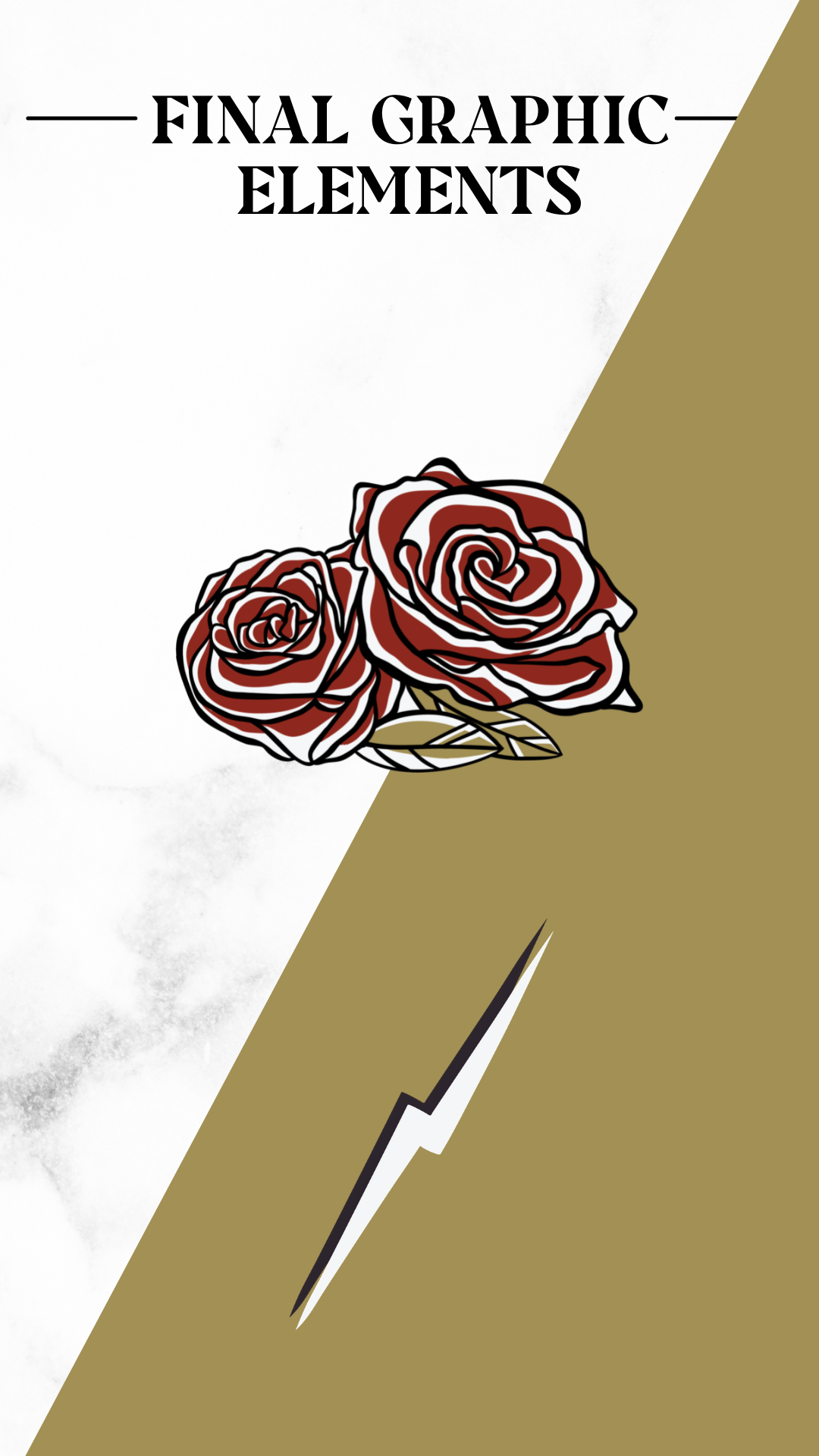
With the logo finalized, the last step of the process was to update the brand book to include all necessary graphical elements and components for the brand. This tool then created a great groundwork for the website which you can read more about here.
Conclusion
Through the course of 3 weeks, the eGuide team worked through both the Brand-storm and logo design process with Zach. The graphic suite and final brand concept that was solidified was a true collaboration made easier with the structured approach of the process. Zach drew on his inspiration and passion for vintage tattoos, his favorite motorcycle helmet, and his unique ability to capture empathic photographs to create a truly memorable and impactful brand suite.
Metrics
Time Spent: Branding - 2.5 Weeks
End Result: Brand Vision, Logo Suite, and Brand Book
Revisions and Editing: 1 round of revisions for brand book, 2 rounds of revisions for logo design
Tools
eGuide directed Zach to use Pinterest to find inspiration and examples of branding elements that resonated with him. To complete the process our team worked in Keynote, Lucid.App, Illustrator, and Google Drive to create for a collaborative and seamless process.

